Content marketers or creators always search for novel ways to grab the target audience’s attention, particularly with a fast scroll time like social media. They use blog posts, articles, videos, podcasts, ebooks, whitepapers, and case studies to achieve this. But to add a new charm to these, you need one more thing, and that is animation, which comes in handy for any posting, whether for video or written content publishing. And in that kinetic typography animation online, a dynamic and engaging motion graphics technique plays a great role.
In this blog, we’ll enter the world of Kinetic typography animation, its history, and its various styles. We’ll also explore the key techniques that can help you master this art form and provide insights into the tools and software that professionals use.
What Is Kinetic Typography?
Kinetic typography, a dynamic motion graphics approach, for motion and visual appeal combines text with animated elements. It empowers animators to infuse vitality into words and phrases, heightening audience engagement. It’s important to note that kinetic typography isn’t a rigid style or method; instead, it’s a diverse animation genre that offers myriad interpretations.
In this brief showcase featuring some of our recent projects, we illustrate the versatile applications of kinetic type.
The History Of Kinetic Typography
The origins of kinetic typography as a genre can be traced back to its rudimentary form, dating back to 1899, when the pioneering Georges Melies dabbled in it. The majority of his early text animation work has been lost to history, therefore there are no samples left of it, despite the fact that he is recognised as the inventor of special effects.
Actual trends in kinetic typography took flight in the 1960s, notably appearing in numerous movie title sequences. The catalyst for this trend can be credited to Saul Bass in 1959, who introduced animated text that seemingly “flew” onto the screen before gracefully merging with the film in the iconic title sequence of “North By Northwest.”
Subsequently, the techniques within this genre have undergone evolution, along with efforts to categorize them. Barbara Brownie’s widely recognized classification system is prominent, which neatly divides kinetic typography into two distinct types: Motion Typography and Fluid Typography. The former is further subdivided into Scrolling Typography and Dynamic Layout.
Nowadays, three more types of typography are 3D, handwritten, and textured.
Within the few categories and subcategories, the term’ kinetic typography’ may appear complex at first glance. However, these explanations are relatively simple to tell the difference and comprehend.
Motion– Scrolling Typography
This category pertains to text that traverses a plane, whether horizontally or vertically, or exhibits forward and backward movements akin to what’s observed in Star Wars.
It proves particularly effective when dealing with lengthy sentences or words, as it lends a graceful and unhurried ambiance to the video. Conversely, a swifter and more dynamic motion, occasionally incorporating overlap, injects a heightened sense of vigor.
In the text animation showcased below, crafted as part of our award-winning motion brand identity work for the Hayfin investment bank, you’ll witness a refined text animation that reinforces the brand’s understated confidence.
Motion– Dynamic Layout
Here, the components composing the text undergo shifts in their spatial relationships. You’ll observe letters and words moving apart on a two-dimensional plane or even in three-dimensional space.
As stipulated in the project brief, a dynamic layout becomes especially valuable for videos requiring impact or dramatic effects. In the following example, we melded 3D motion graphic animation with kinetic typography to transport words and letters through physical space, exemplifying how D+B, our client in the construction industry, breathes life into designs.
Fluid Typography
This usage of text animation that is entirely different from physical letter movements. Instead, it focuses on transformations and evolutions occurring right before your eyes.
In the instance from the Annual Report video of the Chartered Institute of Procurement & Supply (CIPS), we commenced with a dynamic layout. Subsequently, we provided a straightforward demonstration of fluid typography, where the letters’ stand out’ are dynamically etched across the screen.
3D Typography
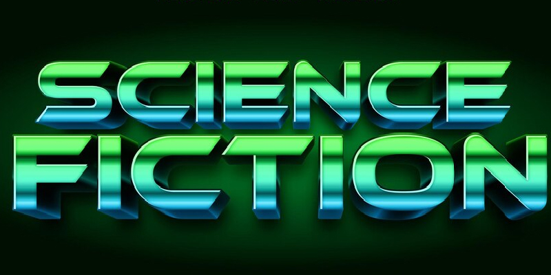
Three-dimensional typography is moving text in a 3D space. Such textwriting has words that portray an illusion of depth, dimension, and interaction with shadows as if natural and occupying the physical world.
With text appearing to pop out or recede in the 3D typography, it is almost as if it is moving. You can achieve this impression with extrusion to determine the thickness of the letter.
This typography can interact with realistic virtual light sources to give an “authentic” 3D look – casting shadows, reflecting light, and portraying shading, rendering it more real.
3D typography’s primary goal is to create an illusion of reality in films, computer games, and advertising campaigns that require advanced and vivid visual presentations.
In 2023, the worldwide 3D animation market was worth roughly 19.89 billion U.S. dollars, which was a 2.05 percent increase from the previous year when it was 17.94 billion dollars. They expected this number to keep rising and reach over 27 billion dollars by 2026.
Hand-Drawn Typography
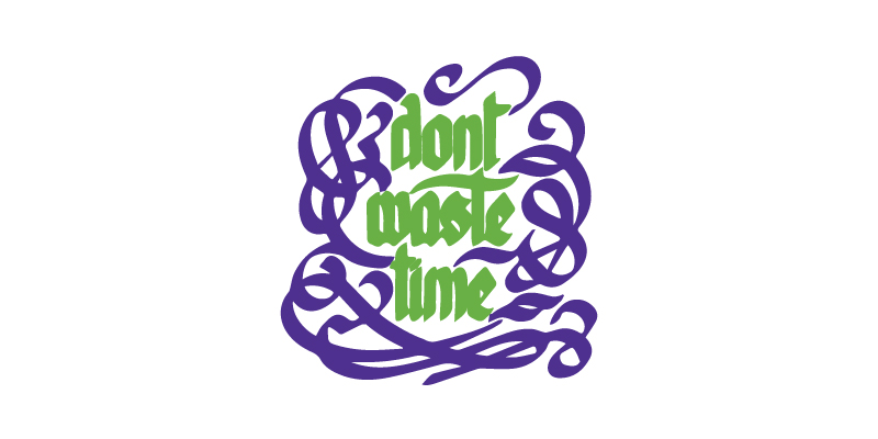
This is an animation of the drawing of text that simulates the handwriting of characters and/or words. Such an approach often brings a personal, creative, and individual touch to text animation.
Animated lettering and words to resemble hand-drawn illustrations or calligraphy, with a personal touch to every word.
When the intent is authenticity, and artistry is expressed through hand-drawn typography, a bond with the audience comes with the impression that artistic hands have created it.
It is ideal for artistic freedom and can be helpful in different projects, such as commercials or explanatory videos, for creativity and artistry.
Textured Typography
Textured typography is all about the usage of textures, patterns, or images in text and animating them. You will get a tangible and visually captivating effect.
You can have a variety of textures, patterns, or images in the lettering encompassing wood grain, metal, fabric, or natural elements like leaves.
The use of textures imparts a tactile quality to the text. You have the illusion of touching and feeling the letter’s surface. This enhances the visual appeal and evokes specific emotions or thematic elements.
Applicable in design and marketing to seize the audience’s attention. It infuses the text with depth and intrigue to stand out and leave an eternal impression.
Kinetic typography trends are constantly evolving, serving as a versatile tool for text animation users. Its utility spans various applications, be it as a foundation for creative proposals, a narrative enhancer, or a means to accentuate specific moments within a script.
The choice of animation style hinges on the narrative’s mood and the extent to which the text must convey information. Furthermore, when briefing on “kinetic typography,” one must not overlook the influence of factors such as font selection, kerning, leading, and other elements shaping the myriad text animation examples witnessed thus far.
Primary Techniques In Kinetic Typography Animation
Creating captivating Kinetic typography animation requires a fusion of artistic aptitude and technical expertise. Below are vital techniques to master this art:
- Texture and Style: Kinetic Typography extends beyond plain, two-dimensional text. Enriching visual impact involves the incorporation of texture, depth, and stylistic elements. Experimenting with various fonts, colors, gradients, shadows, and visual enhancements imparts a distinct and personalized aesthetic to your Kinetic typography animation.
- Timing and Rhythm: The desired message of animated text must be communicated with precision through time and rhythm. Making text movements coincide with music or sound effects creates a seamless, peaceful experience. A grasp of timing and rhythm principles enables the creation of animations that flow naturally and fluidly.
- Integration with the Environment: Kinetic typography animation should seamlessly meld with its surroundings. It should harmonize with the animation’s overall design and aesthetics, whether blending in discreetly or commanding attention as needed. Mindful consideration of context and ensuring effective typography interaction with other elements yield a unified visual experience.
Tools For Kinetic Typography Animation
After knowing primary techniques, you must be aware of Kinetic typography animation tools. There are multiple, but the most prominent are these.
- Adobe After Effects:Regarding Kinetic typography animation, Adobe After Effects is an impressive software with numerous tools and features. It provides precise control of animation parameters, allowing the exploration of various effects and transitions.
- Cinema 4D:A 3D modeling, animation, and rendering software with depth of field and sophistication to enhance animated texts. It has powerful tools for achieving three-dimensional lettering and without a glitch integrating it into your movies.
- Blender:In this case, blender, an open-source 3D creation suite, provides formidable animation tools in texturing, illumination, and rendering that are paramount in designing Kinetic typography animation.
- Maya: The most popular professional 3D animation software that is widely accepted in the film and gaming industries. A wide range of tools that enable users to create the best Kinetic typography animation, complete with elaborate details and realistic effects that are superb.
How To An Expert In Kinetic Typography Animation?
Expertise is only way with rich practice, trial and error, and a deep understanding of the field. Here are some guidelines to support your journey:
Study Typography
To make a compelling Kinetic typography animation, one must understand typography basics. Look at different fonts, their combinations, hierarchy, and readability. Learn about typographic principles like altering letters, lines, and general text spacing.
Analyze Existing Work
Look at the work of top typography animators. Watch their movements, pacing, and what they do in a scene. Dissect their movements and study how they have developed the skills and how they have decided on them.
Experiment and Iterate
Be ready to experiment and try out various styles, techniques, and programming tools. The magic of typography has its roots in its flexibility, which lets us continuously improve through experimenting and refining our skills.
Solicit Feedback
Share your work with other animators, designers, and mentors, and actively seek their feedback. Such critics provide room for improvement and may open new perspectives on your writing.
Conclusion
Kinetic typography animation online is a captivating art form, allowing words to transcend their static essence and transform into compelling visuals. You can make Kinetic typography animation that leaves an impression on your audience by learning techniques, using the appropriate tools, and continually honing your talents. The art of converting words into visually striking animations opens the door to boundless creativity in animated storytelling.
If you’re considering launching an animated video project for your business, you’re in the right direction.
Animetus, a 3D and 2D animation company, specializes in motion design, branding, and video animation services in the USA.

