The phenomenon of characters moving on the screen is nothing new. It actually dates back to the 1950s, when the film title design was a burgeoning art form, However, its popularity has increased. There are more movies and TV shows nowadays. This means more and more of the sequences of title design and animated typography. More importantly, the sudden rise of the internet and has seen motion typography and typography animation companies almost everywhere on the websites, apps, and screens.
Advanced technology and software have made animated typography accessible to more people. This, coupled with the increasing number of use cases for kinetic typefaces, means that as a budding graphic designer, you definitely need to add motion typography to your arcs. So “What it takes to make kinetic typography that much interesting?” Well, we’re here to answer these questions, so join us in diving into the wonderful world of motion typography.
What Is Kinetic Typography?
The technique used as the combination of the motion and text to deliver ideas and emotions is called kinetic typography animation. This is a technique that uses moving text to tone, grab attention, and is used for entertainment purpose. It seems everywhere these days, as it’s used in mobile applications, ads, movies, and websites to make words more expressive.
What Makes Typography Great?
“Kinetic typography” sounds pretty fancy, but it’s actually a more technical term for “moving text.” For this reason, it is sometimes called motion typography. There is no fixed way to animate text, shrink or expand letters, move on the web page, change color, distort, and the effects of various creative techniques used by graphic designer may receive.
Unlike static text, kinetic typography animation can grab the attention of your audience. Manipulate and transform text with movement to achieve a variety of effects. Emphasize where you need it, convey emotion and evoke ideas, and transform simple text into powerful messages.
Modern Kinetic Typography is more accessible and has a lower barrier to entry than ever before for those just starting out. With the increasing of web design services and faster speed of broadband, there are more and more ways to create and use cool typography animations.
Pros of Kinetic Typography
-
Make your content eye-catching and unforgettable
People pay more attention to moving objects than stationary objects. Use this eye-catching Kinetic Typography Animation to highlight the main features of your promo video.
It is easier for people to remember the words after the video is over, and the message transformed as Kinetic Typography is a mixture of motion graphics and words.
-
Improve your brand identity
Bring more brand identity into your advertisements with the help of Kinetic Typography. Enable creative presentations that use moving text to make your brand stand out.
Words are powerful, so tell your audience the nature of your business/brand or product through font types, colors, text movement, etc.
-
Used with different types of content
When it comes to how you incorporate kinetic typography, the possibilities are virtually endless. Almost any animated or live-action video, by its very nature, can benefit from this method.
It can be used for different purposes and in different videos like SNS animation, commentary, educational, branding, presentations, internal communication, etc.
Examples of Kinetic Typography
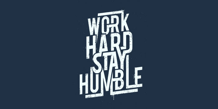
The earliest example of the kinetic type dates back to the 1959 Alfred Hitchcock feature film North by Northwest. This groundbreaking title sequence paved the way for the use of the motion typography for film and television titles. This has now changed into an art form in its own right, and some of the most iconic and amazing examples of animated typographic masterpiece have emerged from the design field.
As time passed, animated typography people stopped using typography in the film and television and appeared in more and more contexts. Recognizing that dynamic text is far more engaging than static text, advertising harnesses the power of type to capture the attention of audiences. Now you can see Kinetic’s typography in all sorts of informational and instructional videos. One of the great examples of how effective motion typography can be is the video of Apple where they were announcing that their every single product will be carbon neutral by 2030. Using hand-made styles and typography animations while using green as a color along with white makes it to reflect the main sustainability message. This is one of the masterpieces in Kinetic Typography videos we’ve seen.
Another cool area where animated typefaces have gained popularity in recent years is poetry videos. You may be thinking about what a lyric video is. A lyric video is a music video for a song, but instead of a regular music video, the lyrics are animated throughout the video. These videos are mostly created for fun and conveyed to YouTube. You must have noticed the videos with more views mostly have Kinetic typography in them, like moving texts and animations which make audience to watch the videos on repeat. The videos use font combination that really reflects the mood and tone of the songs they use in videos, and the background color is also according to the video type, which greatly enhances the atmosphere of the video. Vivid typography, creative illustrations, and vibrant colors are combined to visually present the text. This is a great piece of art, and the fact that it was produced as a student’s work is even more impressive.
How Kinetic Typography is Used in Ads?
-
Commercial advertising
You must have known that there are many advertisements that animate wordplay in various forms. When it is about commercial ads, custom video animation services, follow different animation techniques to save their time and easily interaction with the audience. The core purpose of commercial ads is to grab the attention of the target audience, which increases brand awareness and sales. Kinetic typography is the best techniques for displaying product and brand promotions with moving text.
-
Movie trailers and feature films
When we talk about kinetic typography in film, the only thing that comes to mind is Sir Alfred Hitchcock’s film North by Northwest (1959), known as the first film to use typography.
The way the letters slide on and off the screen looks crude now, but was revolutionary when the images were created. From North by Northwest to Spider-Man, typography has been used to made trailers, movies and feature films start and end amazingly well.
How To Get Started Creating Kinetic Typography?
The first thing you need to create motion typography is software. There are various options to get started for free, but mostly graphic designers choose Adobe to create after effects. My next recommended step is to watch a tutorial or read an article on how to create kinetic typography. It’s also helpful to learn the basic rules of typography and how to treat text from a graphic design perspective. There are a variety of graphic design and animation courses you can take to improve your overall skills, as well as many courses specifically for kinetic types that allow you to focus on developing your all-important concentration skills.
Whether you decide to work things out on your own or take the more research-based route, there are some important things to remember. There are many ways to animate text. As a motion designer, your job is to make sure the message and design work together.
As with many areas of graphic design, it is very helpful to see how other graphic designers have adapted their typography to kinetic and what techniques they use. The goal is not to steal ideas in a big way, but to take inspiration from what you see and find new ways to apply style or add your own twist. It’s also important to be creative and have fun.
Conclusion
Kinetic typography is the art of bringing text to life. You must have heard about the idiom “actions speak louder than words.” But if you take kinetic typography as an example, the words actually move and their impact is double. With different areas of designs, it can be very easy to find out how other graphic designers use kinetic typography and what their unique ideas and techniques. The goal is not to steal ideas in a big way, but to take inspiration from what you see and find new ways to apply style or add your own twist. It’s also good to be creative and have fun while using typography techniques. If you aspire to become a freelance motion designer, creating motion typography can be an important weapon in your arsenal.
If you want to create amazing motion graphics, 2D animations, whiteboard animations, character animations, etc. or are looking for a video editing service, you’ve come to the right place.
Contact us, we are here for you!

